Evenfall Jewelry
Jillian contacted me as she wanted a UX audit carried out on her Squarespace website; a fairly new e-commerce jewellery store that wanted to improve user flow and increase sale conversions.
I started by asking Jillian about her site as no one knows it better than she does. This included her target audience (who she wants to buy from her) and competitor sites. I then logged into the backend of her site and began the analysis. The tools I used included user personas, user flows, heuristic product evaluation, SEO analysis, competitor comparison, desktop and mobile analytics and a report of findings along with a checklist of suggested changes to make.
User Personas & User Flows
I created these to understand who the users are, what they like and dislike, where they are, what device they’re using, what frustrates them etc.
SEO Analysis
Check if best SEO practices are being followed & suggest changes that could get the site higher views & conversions.
Analytics
Looking at both desktop & mobile analytics we can see what is & isn’t working and where the users are struggling on the site.
Heuristic Product Evaluation
I used Nielsen’s 10 guidelines to review the usability of the site from error prevention to consistency and efficiency of use.
Competitor Comparison
Analysed competitor sites to establish what they are doing differently.
Report
I put together all of these findings into a report and gave the client a checklist of changes to make.
A while after the UX audit was completed, Jillian asked me to carry out 2 developments to her webiste.
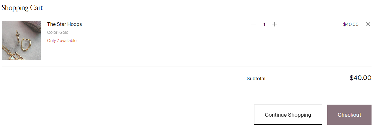
The first task was to add a ‘continue shopping’ button to the checkout page. I mentioned this point in the UX audit because it’s important to make it as easy as possible for customers to add items to their basket, if there isn’t an immediate way to return and add more to their basket they may not do so. The ‘continue shopping’ button isn’t readily available in Squarespace so a plugin was needed.
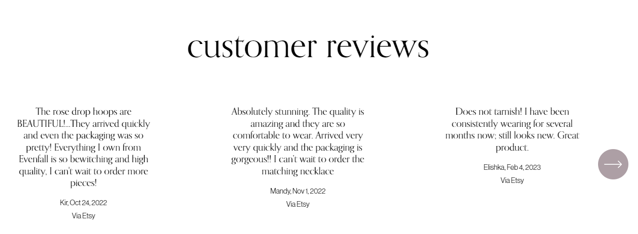
2. The second task was to add a ‘customer reviews’ section on the home page of the website. Jillian has some fantastic reviews so I made a point of this in the UX audit. Sometimes customers need to feel they can trust a brand before buying from them, so it’s important to show reviews if you have them. For this I added in a carousel on the home page that showcased some of these reviews.
“Quickly completed job, great to work with!”


