Henrik Langsdorf
“...To do due diligence I’ve also checked Katie’s references and I very quickly received detailed responses from her clients (small businesses with real people) and I can 100% attest to their positive feedback. She is dedicated, supremely competent, very responsive and exceeded my expectations! What more can you ask for?””
Henrik contacted me as he had a Wordpress site he liked but couldn’t manage himself. He wanted a site on Squarespace with a similar design to the site he already had but one that he could easily update himself if and when he wanted to. I went into his Wordpress site, gathered the content and compressed the images, to ensure they kept high quality but didn’t affect loading time. I then created a new Squarespace site, assigned the client permissions so they could see the development in real time and then began development.
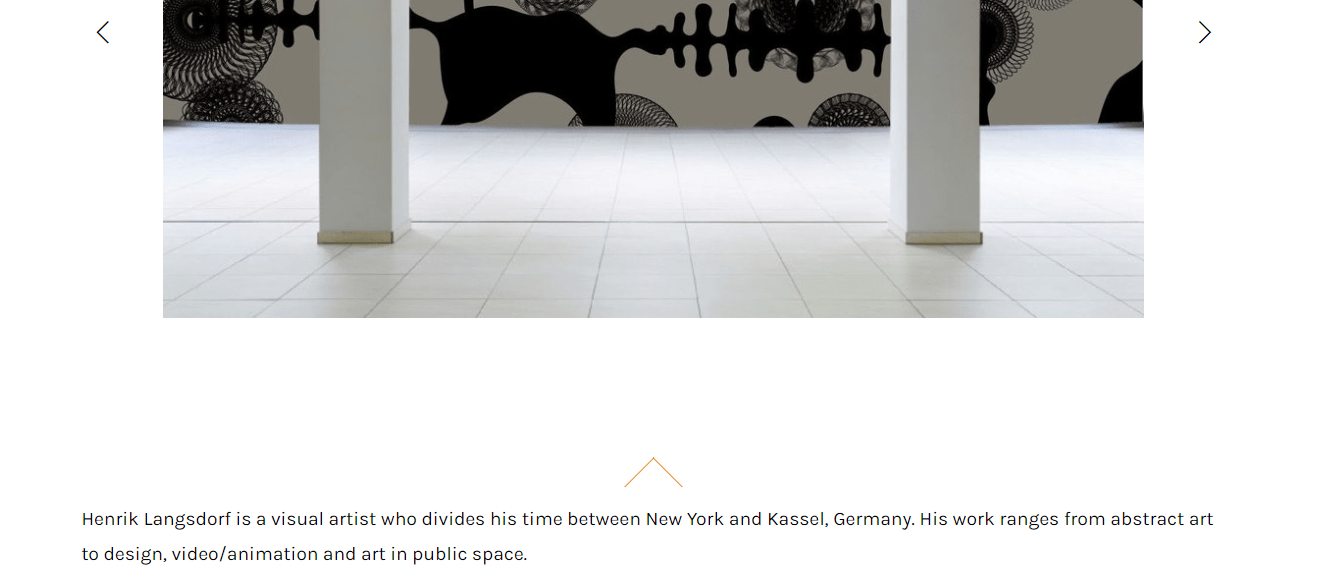
I created the ‘home’ page which the client wanted merged with the ‘about’ page. This involved a slideshow gallery (with custom arrow colours), a block of text and a ‘back to the top’ button which isn’t readily available in Squarespace so did require some coding.
Home page showing styled arrows on slideshow and a ‘back to the top’ arrow above text
In terms of the overall design of the site there were aspects that required code for example a colour change when hovering over the navigation items. I ensured any code kept design consistent throughout the site and didn’t affect any areas it wasn’t directly intended to.
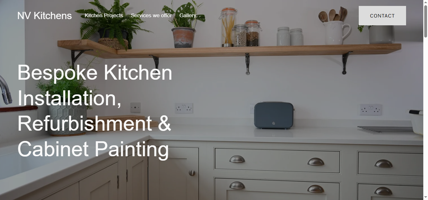
Header navigation
Header navigation item changes colour when scrolled over
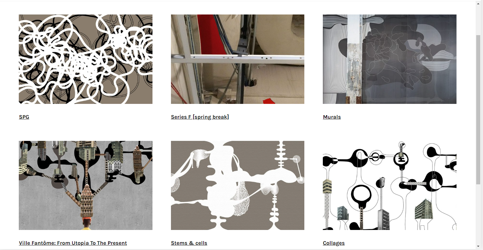
For the ‘work’ page, the client wanted a redesign. Instead of clicking on the main image for each section and seeing a pop up slideshow, as on the old site, the client wanted to click on the main image for each section and be taken to a new page which scrolls through the content for that section. This was achieved with a blog page in Squarespace. I added in the images, ensuring each one was compressed, and ordered them to suit. When the main image is clicked on, a new page appears with more images displayed in a stack.
‘Work’ page. When a section is clicked, the user is taken to a new scrolling page of images.
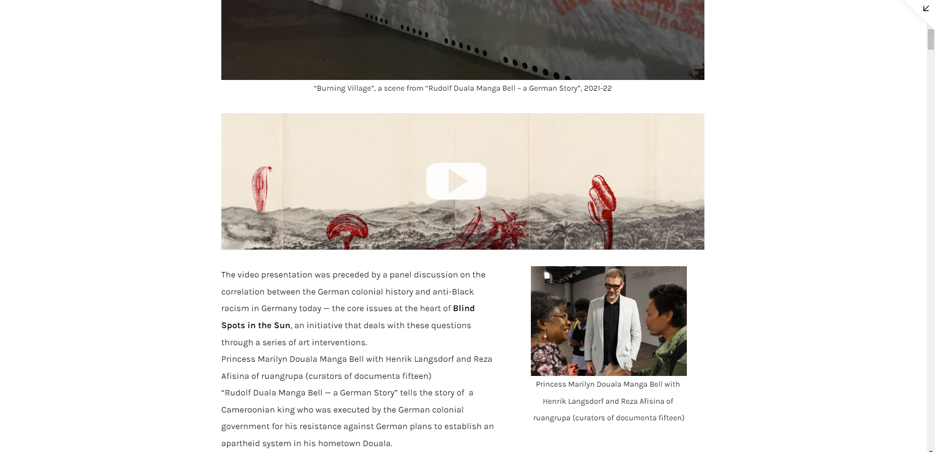
The project page was another blog page but this time with all blog posts displayed as a single scrolling page. The posts included a mix of text, images and video.
There are a few different ways to display video in Squarespace. YouTube is often the easiest to embed and style and won’t count toward your 30 minutes of video storage on Squarespace.
‘Projects’ page is a blog page with all posts displayed on one page
Upon completion I then transferred the domain over from Dream host and assigned ownership of the site. As a Squarespace circle member I automatically apply a 20% discount off annual plans for all of my clients. I provided a 15 page user guide personalised to Henrik and his site so that he can manage the website himself going forward, reducing future costs.


