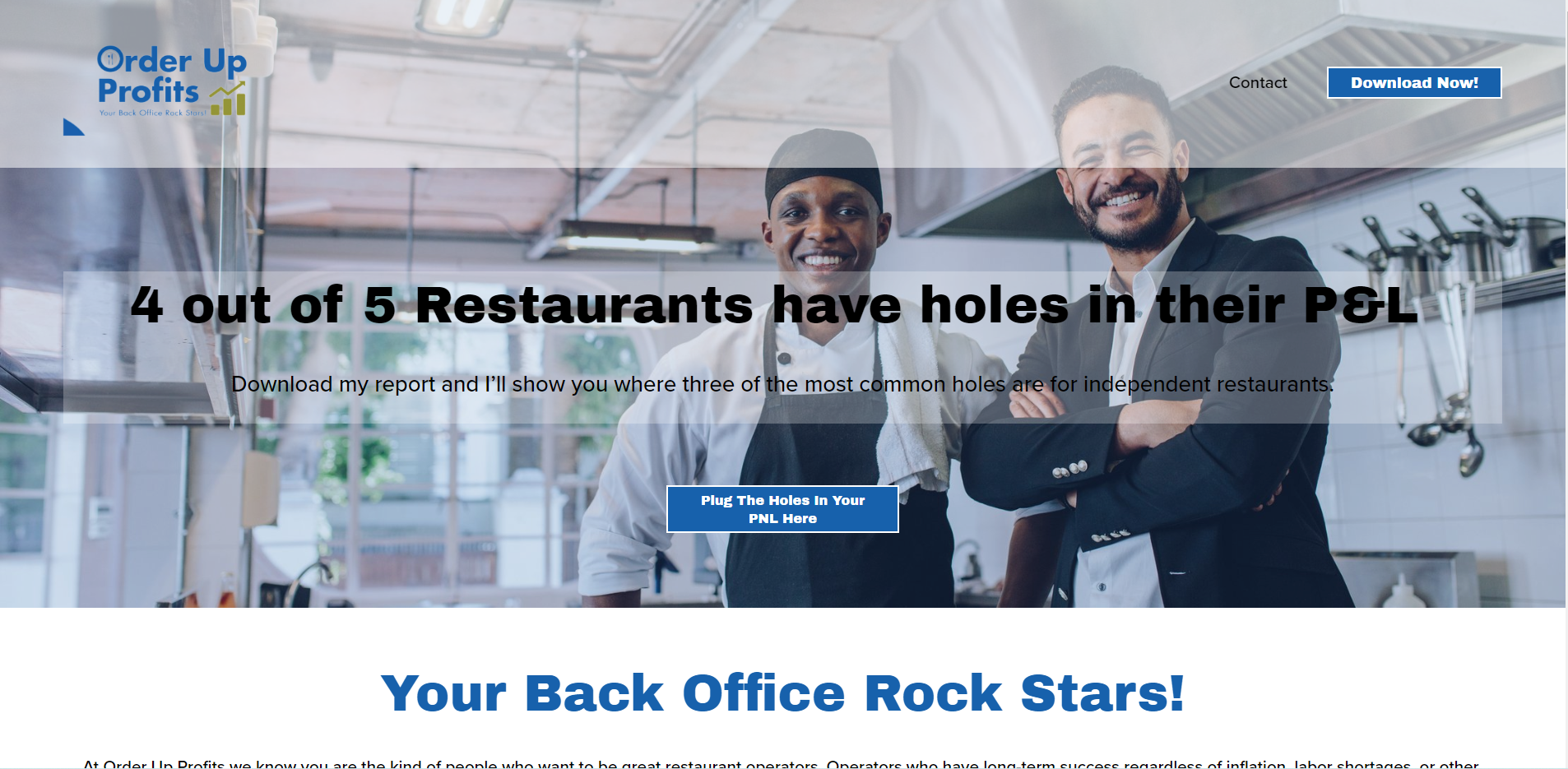
Order Up Profits
“Katie was great! She did everything I needed to get my website off on the right foot and was fast, accurate, and a pleasure to work with!
I will hire Katie again in a heart beat.”
Tim contacted me on LinkedIn because he wanted someone to help make his Squarespace site look more professional. I sent Tim a questionnaire to establish what it was he was after, what other sites he liked and who his target audience was to ensure we took the site in the right direction. We then scheduled a phone call to check we were both on the same page and I began work on his site the next day.
I made a number of changes to Tim’s site to make it look more professional including changing the colour scheme, buttons and headers, restyling sections and creating a contact page. I went through each section to ensure it looked right on both mobile and desktop and before handing back to Tim I created a brand guide for him to give to anyone else working with him in the future to ensure brand consistency.
I really enjoyed working with Tim and look forward to helping him with his Squarespace site in the future.
Home page of ‘Order Up Profits’ with new colour scheme to match logo
Before and After of the ‘how it works section’ on Tim’s site.


