Road Kings
2024
When Road Kings opened in summer 2023, they had a basic WordPress website created for them which they couldn’t update easily and quickly became outdated as it didn’t have a booking system. In early 2024, I developed a brand new website for them in Squarespace which had all the functionalities their fast growing business needed from booking systems to full itineraries and everything in between.
The most important function is the booking system - this new system starts with the length of the tour the customer wants (2, 3 or 4 day) and then goes into specifics - bus pick up time, bus drop off time and whether they require an easy rider, will drive themselves or will ride behind their friend/partner - each option changes the price and this needed to update immediately so the customer knew what they were expected to pay.
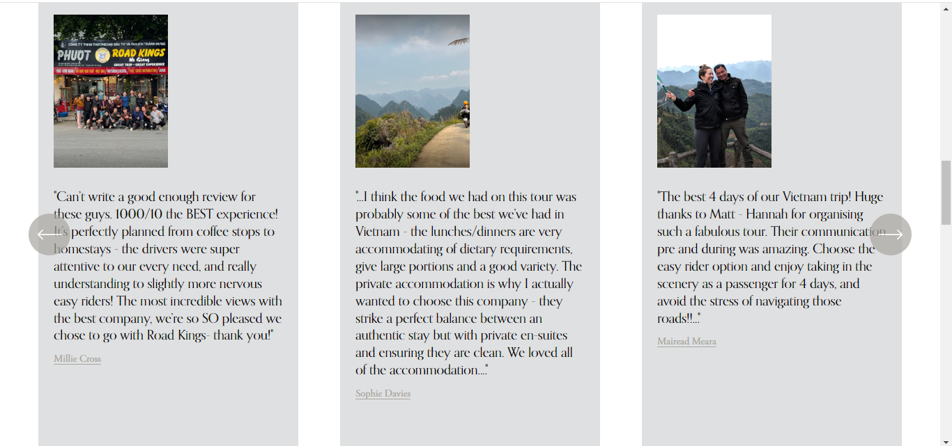
With the new booking system in place, I then worked through adding reviews from Google (so they could be proven to be real reviews from real people) and itineraries - these will change by product and some of them are hidden behind passwords so they can only be given to customers that have paid for their tour.
As the Ha Giang Loop is a tour of the beautiful countryside in Northern Vietnam, it was important that this website highlighted this through the use of imagery.
The website was fully functioning and taking orders within just 2 weeks! I wish Road Kings every success and will continue to support them with the website, should they need it, in the future.
2023
Road Kings are a new business in Northern Vietnam offering motorbike tours. The 2 owners, Matt and Paul, both own restaurants in Ha Giang and are now in partnership with a new tour company. They had a website developed but needed a full UX audit carried out to highlight any weak points and ensure the website is working at it’s best for both local (Vietnam) and worldwide visitors.
I worked with closely with Road Kings in Ha Giang and completed the UX audit within 24 hours as they were on a tight deadline.
As well as the UX audit I also created social media posts for the company, set up an account for them with Get Your Guide and worked out a social media plan to ensure they were covered across all platforms and reaching as big an audience as possible.
Overview
My first task is always to view the website as a user would - can I find everything easily? Is the language used, easy to understand? Are there any steps I’m forced to take that aren’t necessary?
SEO Analysis
Check if best SEO practices are being followed & suggest changes that could get the site higher views & conversions.
Analytics
Looking at both desktop & mobile analytics we can see what is & isn’t working and where the users are struggling on the site.
Consistency
Not only do you need consistency to stand out as a brand but also to make your users feel comfortable. I go through the site and note what doesn’t feel quite the same as other areas.
User Control and Freedom
Users want to complete tasks as quickly as possible in as few steps. It’s also important to note, users will make mistakes so your site needs to allow them to undo this.
Competitor Comparison
Analysed competitor sites to establish what they are doing differently.
Recognition
Users shouldn’t be expected to remember actions they’ve taken so its important to leave subtle reminders.
Report
I put together all of these findings into a report and gave the client a checklist of changes to make.
“Katie was a volunteer for us for about 2 weeks and really exceeded all expectations.
We had paid a business to create a website for our brand 2 weeks prior to Katie’s arrival and this business had let us down. Our site was lacking in all areas. Without us even asking, Katie went through the whole site giving us a complete make over. From where certain buttons should be, which ones should be added or removed. Other page/picture ideas to better reach our customers both in an easier more fluid transaction and a more relatable and informative way.
Katie was just a volunteer for us but the report she wrote was as if she was working for us which makes me truly believe she gives it 100% regardless.”


