derailleur.
“I had a great experience working with Katie, who surpassed my expectations and made my website look great. She understood my project requirements, offering valuable suggestions to enhance the design and functionality. Throughout the development process, Katie showcased technical prowess and attention to detail. Communication was seamless, and she promptly addressed any concerns immediately. I highly recommend Katie for her outstanding skills and dedication to client satisfaction. I look forward to working with Katie in the future”
Lucia contacted me via LinkedIn as she had created a Squarespace site she needed further developing. The tasks I carried out were as follows:
Add social sharing buttons to each article
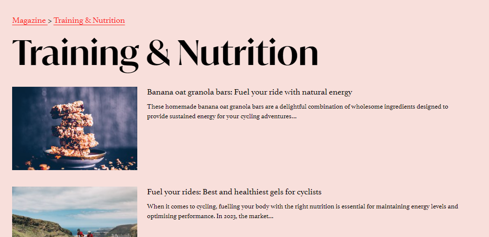
Change the URL so instead of ‘/blog’ the URL reads ‘/magazine’
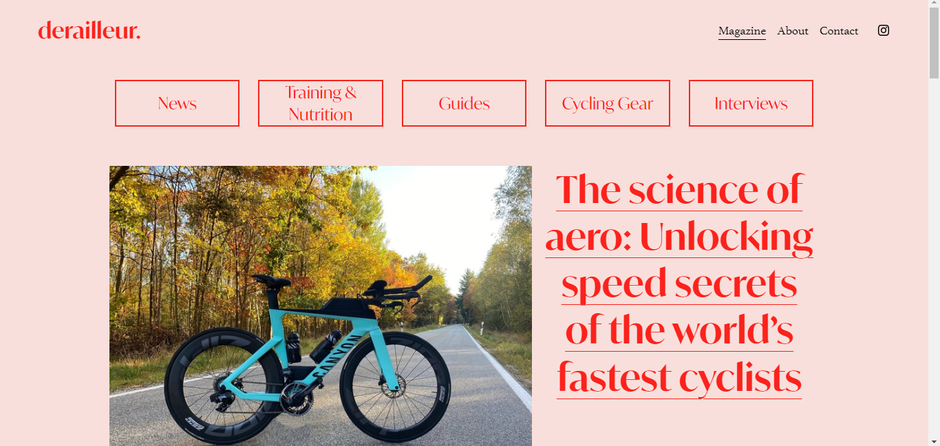
Add in a home page header that can be updated with the most recent article
Design and implement a favicon
Create subcategories on the home page which change as new articles are written
I worked closely with Lucia to get the site right for her. There were some changes we made that just weren’t right so required alternatives for example, we initially removed the ‘about’ and ‘contact’ links from the header to the footer but didn’t like how this looked so then moved them back to the header but in a drop down menu named ‘more’. This didn’t feel quite right either so after adding in second line navigation, on just the home page, for the magazine categories we decided to add the ‘about’ and ‘contact’ links back into the header navigtation. Sometimes, when working with clients, what they initially thought they wanted doesn’t feel quite right to them when it’s developed and that’s perfectly ok - websites need to feel right for the user and the owner so sometimes it’s just a case of trial and error until you’ve found the perfect match!
I really enjoyed working with Lucia and am excited to see where she takes the derailleur website now she’s equipped with her fully personalised user guide !


